Showing posts with label grey. Show all posts

Saturday, August 24, 2013

Enchanted Polish Beautiful Rule Breaking Moth Swatches and Review


 Enchanted Polish Beautiful Rule Breaking Moth.
(press sample)
This is a soft medium grey base with small flecks of gold-green duochrome glitter and a subtle holographic effect.  The polish has a speckled look from all the different shimmer particles in it, but it dries completely smooth.  The green duochrome glitter gives the grey base a slight green tinge and the added holo makes it look alive.

I have to say, indie polish has really won my heart.  The handmade indie brands make all the colors we want and that commercial/salon brands won't.  Enchanted Polish is one of those brands that I have been extraordinarily impressed with; every single color I've tried has completely blown me away. 

This color continues in that tradition of impressing the hell out of me.  Grey glittery duochrome holo?  SO GOOD. 

Beautiful Rule Breaking Moth is $15 at Enchanted Polish

(sent for review)

Monday, August 6, 2012

OPI Germany Collection Fall 2012 Swatches and Review

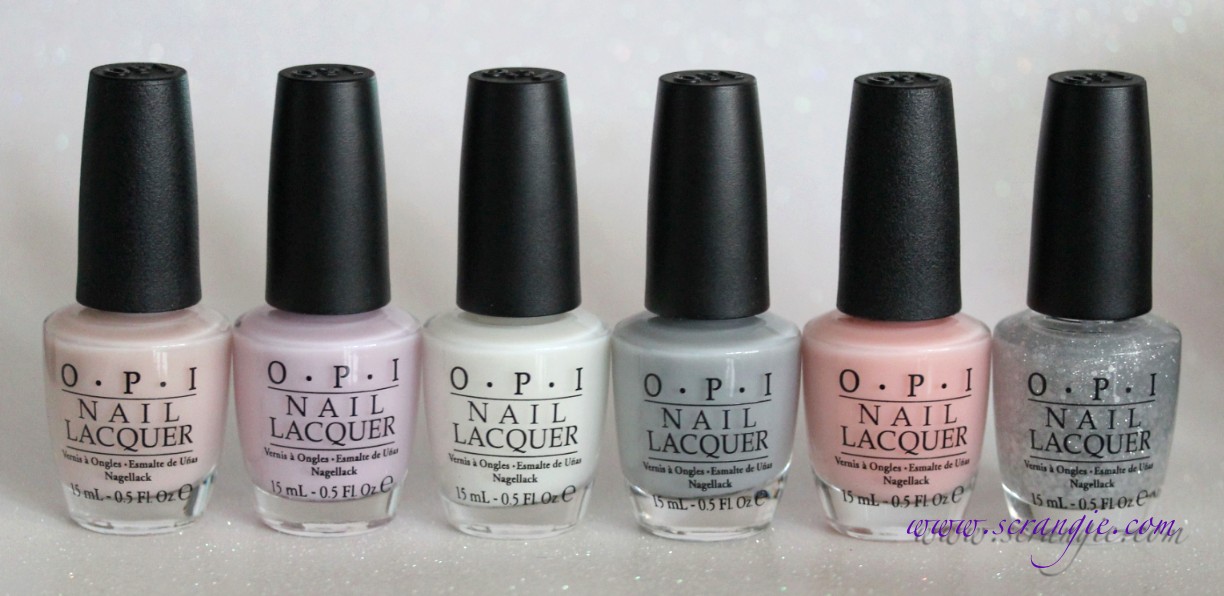
OPI has chosen Germany as the country for this year's regional-themed fall collection. Hmm... Ich könnte versuchen diese auf Deutsch schreiben... But I would probably butcher it with my horrible grammar. Anyway, here's the lovely OPI Fall 2012 Germany Collection, with twelve colors as always.


OPI Berlin There, Done That. A purple-tinged grey creme. It's pretty light and the purple is subtle.


OPI Danke-Shiny Red. A super shiny metallic red with a silly name. It's so metallic and luminous that it's hard to capture the true color because it glows too much. It's a cooler toned red, medium bordering dark, with a smooth, shiny, almost chrome-like metallic finish. Think Zoya Elisa, just cooler and darker.


OPI Deutsche You Want Me Baby. Absolute fall perfection in a bottle. This is a rich, rusty orange with a shimmer finish that's almost as metallic as Danke-Shiny Red. It has that look where it's a little darker around the edges and lighter in the center, and you know how much I love that. This is just such a perfect fall/harvest/thanksgiving type of color. I adore it.


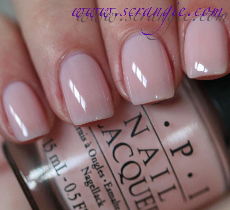
OPI Don't Pretzel My Buttons. Neutral pale beige creme. Soft-looking finish. Actually looks pretty good on me despite being such a plain color.


OPI Don't Talk Bach To Me. A really weird mix of dijon mustard yellow and spring green with subtle hidden shimmer. Like a lighter, dirtier, more faded version of Rescue Beauty Lounge Abi, or maybe even a lighter, less shimmery China Glaze Trendsetter. Very unusual.


OPI Every Month Is Oktoberfest. Another amazing one. This is a vivid purple base with red, purple and gold shimmer. It's dark and vampy but at the same time colorful. Like a blackened version of Max Factor Fantasy Fire or Urban Decay Toxin, but without the green duochrome. I want you to see how pretty the purple base is, so I took a picture of this at one coat:

OPI Every Month is Oktoberfest (one coat)


OPI German-icure by OPI. A dark, vampy, brown-tinged shimmery red. Looks velvety and shiny, not too dark, not too bright, ever so slightly metallic-shiny and even has a subtle gold shift to it. I always love these types of colors, and this one reminds me a tiny bit of La Boheme!


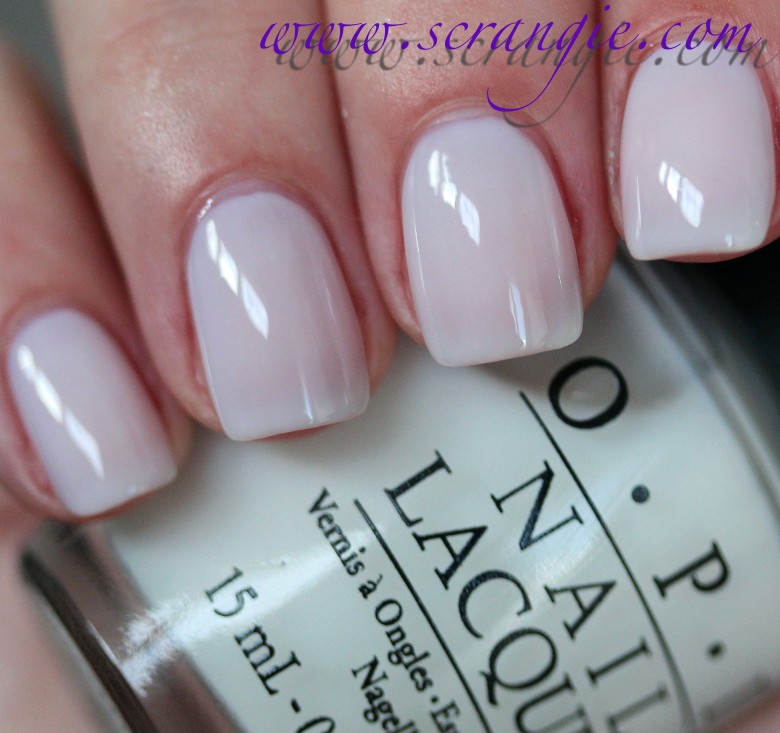
OPI My Very First Knockwurst. Pale putty pink creme. Little bit of grey or beige in it so it's not a clean pink.


OPI Nein! Nein! Nein! Ok Fine!. Dark green-tinted grey creme. Dries quite a bit darker than bottle color.


OPI Schnapps Out Of It!. OPI calls this color mauve, but I'm not seeing it mauve. I'm not actually sure how I would describe this color. Warm... rosy... earthy, like terracotta but more pink. Orangey-pink-brown? And with hidden silver shimmer.


OPI Suzi and the 7 Düsseldorfs. A red-toned purple shimmer. Lighter than Zoya Suri, redder than OPI Purple with a Purpose, and a more sheer, less frosty-metallic texture. Not as dark in real life as it looks here.


OPI Unfor-Greta-bly Blue. Medium dirty blue frosty shimmer that leans ever so slightly teal.

The formula on these was excellent. Perfectly smooth and even and with flawless brushes. Some of the shades were thinner than others, but none of them gave me any trouble. Most only needed two coats for full opacity, but I did three of all. Suzi and the 7 Düsseldorfs and Unfor-Greta-bly Blue look best with three coats. Dry time is very fast.

Pretty decent fall collection. The vampy shimmers are incredible and that glowing Autumn orange is perfect. Perfect! But then again, I really have a thing for orange and anything that reminds me of fall. The nudes/taupes/beiges are nice, but I could take them or leave them. I don't particularly care for Unfor-Greta-bly Blue (too plain) or Schnapps Out Of It! (too 1980s leftover nail polish), but the rest are good. And good formula.

My top picks are Deutsche You Want Me Baby, Every Month is Oktoberfest and German-icure by OPI. All three are gorgeous and definitely worth a look.

Germany by OPI will be available August 8, 2012, at Professional Salons, including Beauty Brands, Beauty First, Chatters, Dillard’s, JCPenney, Pure Beauty, Regis, Trade Secret, and ULTA, for $8.50 ($9.95 CAN) suggested retail for each Nail Lacquer.

EDIT
: OPI has confirmed that Every Month is Oktoberfest is indeed the purple and German-icure by OPI is the red.

(This was sent for review.)

Wednesday, July 18, 2012

NARS Storm Bird Nail Lacquer Fall 2012 Swatches and Review

For the nail color component of NARS Fall 2012, there's just one lonely color: Storm Bird. I think the name is fitting, just look at that bottle. It looks like there's a thunderstorm brewing inside it.


NARS Storm Bird. Limited edition. Storm Bird is a dark grey creme. It looks more neutral than a lot of greys; I don't see any strong green or blue tones in it. Perhaps it leans more to the blue side, but not by a lot. It dries darker than bottle color.

The formula on this was excellent, just as nice as the Thakoon for NARS collection polishes were. It was smooth, just the right viscosity, had a good brush and was almost entirely opaque in one coat. I used two coats here. Dry time was quick.

Storm Bird is a very nice polish. It's dark and stormy like the name implies and it has a great formula. I like it, but I wish that they had released more nail colors for fall!

NARS Storm Bird Nail Lacquer is limited edition and retails for $18. It is available now on narscosmetics.com.

(This was sent for review. Post contains an affiliate link.)

Thursday, June 7, 2012

Jessica Awakening Collection Spring 2012 Swatches and Review

What's this? A second spring collection from Jessica? And it's a complete 180 from the flashy, sparkly colors in the previous one. The Awakening collection is all about soft, muted earth tones.


Jessica Flutter. Soft, light taupe creme. It's a mixture of light neutral brown and grey without purple tones. The color of dried clay mud.


Jessica Monarch. A light grey creme. No blue tones. As much as I like blue-toned greys, I have to say that I do actually prefer these more neutral ones. They're easier for me to wear and don't make my hands look as red as some of the blue ones do. But.... why is this drab grey called Monarch? Monarch and Wing It should switch names!


Jessica Sky High. Light blue. Very muted looking, like there's a little grey in here to keep it from looking too bright. I really like this, especially the name.


Jessica Soar. Beige/khaki creme. Maybe a little touch of green to it, but it's subtle.


Jessica Sunrise. Light pink putty creme. Like the others, this one has a muddy/dirty/muted look that keeps it soft and subtle, not white-based bright or chalky. A little bit of a boring color, but I kinda like how it looks on my hands. Feels elegant somehow.


Jessica Wing It. A coral orange frost. It's more colorful and bright than the other colors in the collection, but it is still soft and muted. This is not a bright summer orange. It's very toned-down, not too saturated, and looks even softer and more subtle from the addition of silver frost shimmer.

The formula on these was so-so. It felt a little globby and strange going on and didn't apply in smooth, thin layers. Instead, it applied as thick (yet slightly runny, like early 3-free formulas), uneven layers that stayed wet for a long time and self-leveled after a minute or so. I needed to wait at least 5 minutes between coats because of how long they took to set. Applying a new coat too soon made lumps and bulges in the polish. The brushes in these were also slightly off; they looked frayed and felt unusually loose. Jessica normally has really nice, tight, precise brushes, so that was a surprise. It was difficult to get a smooth application due to the weird texture of the formula and the odd brushes. The opacity of all of these was good so I only needed to do two coats on all. Drying time was long.

Not a terribly exciting or even unique collection, but I did like how creamy and soft they looked on my nails. I wasn't a fan of the formula or application, though. I like Sky High, Monarch and Sunrise the best out of the set. Some of the colors remind me of the Zoya Feel collection.

The Jessica Awakening collection is available now on jessicacosmetics.com.

(This was sent for review.)

Friday, March 23, 2012

OPI NYC Ballet Soft Shades Collection Spring 2012 Swatches and Review

OPI's Soft Shades collection this year is inspired by the New York City Ballet. It's an assortment of five light, sheer shades (beige, lilac, soft white, grey, peach-pink), plus a sparkly layering glitter that can be worn alone or layered over any of the soft shades. This collection surprised me. I thought they were just going to be boring/plain sheers based on the promo pictures, but when I got them on my nails, I suddenly realized they weren't. They're JELLIES.


OPI Barre My Soul. A light white-based soft beige. It has a some peach in it so it doesn't look straight beige and flat, instead it looks more like a very light fleshy color with dimension to it from the jelly finish.


OPI Care To Danse? This one is a very, very pale lilac. It also appears white-based when it's on the nail, but not stark or chalky. It looks a little more pink-colored in real life, but it seems more purple in the bottle.


OPI Don't Touch My Tutu!. This is a soft white jelly. It doesn't seem to have that subtle blue undertone in it that Essie Cloud Nine has, but it still has a similar brightening effect. This is such a dreamy white. It looks like fluffy clouds and marshmallows.


OPI My Pointe Exactly. Now there's something different. A grey jelly. This grey is blue toned, and in some lights it looks more like a slate blue than a pure grey. You would think that a sheer grey would just look murky and dirty, but it doesn't. It actually looks really good and that lovely jelly finish gives it depth that opaque cremes don't have.


OPI Pirouette My Whistle. This is a very fine light silver glitter and a small pearl white hexagon glitter in a clear base. This is a sheer glitter that's perfect for layering (not so dense that it covers the base color too much, not so sheer that you need multiple coats for it to show up), but I think it actually looks nice alone. The glitter is very delicate and twinkly, reminds me of those very old OPI holiday glitter topcoats like Yule Love This Silver and Nutcracker Sweet with that superfine sparkly type of glitter.


OPI You Callin' Me A Lyre? This one is a peachy pink. It has a little more color to it than your typical OPI Bubble Bath / Essie Ballet Slippers type of shade to keep it from looking too corpse-y. I normally don't like these nearly-white pinks because it makes it look like I've lost all the blood flow to my fingers. You Callin' Me A Lyre looks a little more lively than that.

The formula on these was also a surprise for me. With these types of colors, I usually expect them to be streaky, watery, or uneven in some way. These apply like a dream, streak-free and self leveling. At one coat they look like a sheer, streak-free color gloss and it actually looks really nice; soft and clean. The white base and jelly finish in the shades gives this blurring/softening creamy effect. Here's how they look at one coat:

OPI Barre My Soul (one coat).


OPI Care To Danse? (one coat).


OPI Don't Touch My Tutu! (one coat).


OPI My Pointe Exactly (one coat).


OPI You Callin' Me A Lyre? (one coat).


Since they're not streaky, you can wear as many coats as you'd like. They look like a subtle creamy gloss at one, slightly more opaque at two (but the jelly finish becomes more apparent), and perfectly jelly-like at three:

Don't Touch My Tutu! - one coat.


Don't Touch My Tutu! - two coats.


Don't Touch My Tutu! - three coats.

To make the already nice polishes even nicer, you can layer them with a coat of Pirouette My Whistle. Horrible name, fantastic color.

In the bottle, Pirouette My Whistle looks like it might be chunky. It has some small but substantial looking hex glitter and also some near-microglitter sized silver flecks. Luckily, this glitter is so light that it lies completely flat and smooth on the nail and it doesn't do that annoying thing where the glitter sinks into the wet polish and leaves little divots near every particle. Reminds me of Nubar White Polka Dot, but not an exact match. Here's how each shade looks layered with Pirouette My Whistle:


OPI Pirouette My Whistle (one coat) over Barre My Soul.


OPI Pirouette My Whistle (one coat) over Care To Danse?.


OPI Pirouette My Whistle (one coat) over Don't Touch My Tutu!.


OPI Pirouette My Whistle (one coat) over My Pointe Exactly.


OPI Pirouette My Whistle (one coat) over You Callin' Me A Lyre?


The formula on these was perfect. The texture was thicker than the average watery sheer and that prevented the running/pooling problem I usually have with these types of colors. They weren't streaky as long as I paid attention to how hard I was pressing the brush, and they seem to self-level really well if I did apply them unevenly in some areas. They're sheer, but at three coats (what I'm wearing in the photos) they look like a perfect creamy jelly on me. They dry very fast and every shade dries to a glossy finish (even the glitter) without added topcoat.

You know, as much as I normally hate sheers and soft shades, I have to admit that I actually like these. It's that milky jelly finish. I love jellies, and when they have that added milky look, forget it. Instant like. It looks so squishy and soft and dreamy, like clouds and marshmallows and fluffy bunnies... They're so cute that it's almost sickening. The softness and depth of the milky jelly finish makes the nails look clean and well groomed, not dead and lifeless, and the formula is perfect. Adding the delicate glitter on top just takes it to the next level of cute. I'm also impressed with how shiny/bright/twinkly the glitter is without it being chunky or gritty or hard to remove.

All in all, while I don't normally "do" sheers (especially sheer pinks, ugh), the milky jelly finish on these is really appealing to me. I just can't help myself, they're too cute not to love. I'll likely only wear the lilac and grey with any regularity, but I've been wearing Barre My Soul with Pirouette My Whistle since last night and I have no desire to take it off yet...

The OPI NYC Ballet Soft Shades collection officially launches in April, but they are already available in some stores.

(This was sent for review.)